A Few More (Shoddy) Pictures of the House, Plus a HUGE Thank You to Sanders

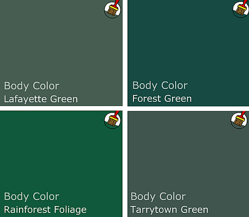
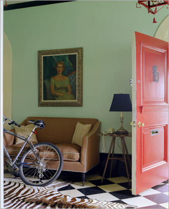
I really, truly appreciated all your thoughtful comments and feedback on my last post. Leopard rug is scheduled to arrive Monday, so more updates on that soon. In the meantime, so many of you asked for the paint color I used in the front room that I thought I should repost it with the name of the color.

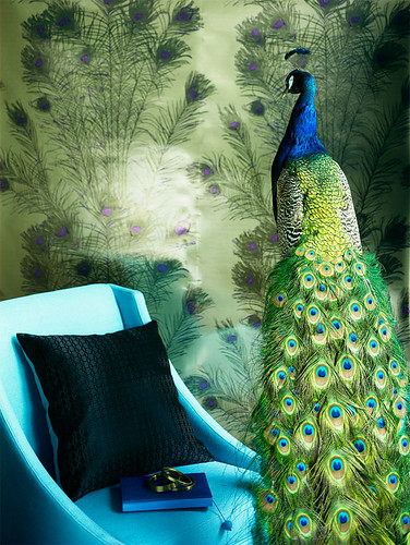
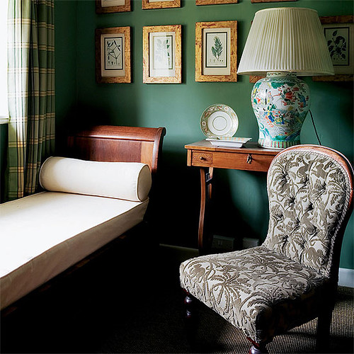
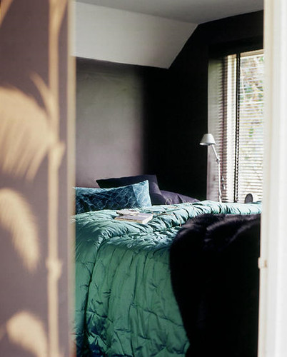
It's Benjamin Moore Dark Harbor, mixed 25% darker.

Let me just take a minute to say that I am a picky mofo. I can tear perfection into a million imperfect pieces. That's why Sanders is such a gem. In case you just started reading or don't remember, Sanders is the paint genius who manages my local Benjamin Moore -- he's also the brains behind the Ask Sanders column. Without him I would I have hideous turquoise walls that make me cry angry tears of anger.

If you live in Austin or thereabouts (one reader drove up from San Antonio just to meet with Sanders!), go see him before he starts his own paint consulting empire and starts charging for his advice. He's that good.

Plus look at his sweet little face! I love me some Sanders.

benjamin moore dark harbor Moving on: more Dark Harbor pictures. Wish I'd thought to shoot this with a color card so it would be truly accurate, but I think this is close. It goes from navy to almost billiard green, and everything in between.

benjamin moore dark harbor

Can't believe I am posting this horrible picture, but it's been raining forever so I haven't had a chance to reshoot without all the toys. I think I took one picture of this side of the room and gave up because it is a pita to shoot without off camera lighting. Anyway, you can see that DH does go a lot lighter when faced with direct sun.

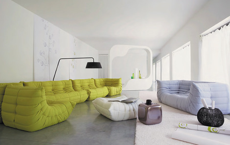
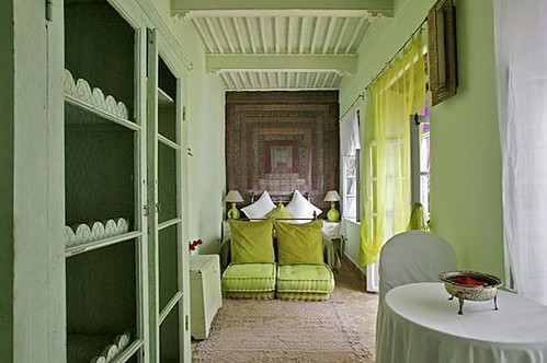
While we're all staring at this dumb picture, let's talk about built in shelving. The front room is teeny tiny, so to save space I really wanted to build a nook around the sofa, kind of like this:

But with far less beige... Anyway, there are two problems. First, the chair rail. Yes, we can remove it, but blending in the texture is going to be a job x infinity. Second, I don't know if we have enough depth on that side of the doorway -- it's about 12." Any advice on how to handle this? Ideas?

Once again I am depending on you to solve all of my problems.

Why not get busy with world peace while you're at it?

Ask Sanders: Rossana's Pear Green Nursery

It's time for another installment in our Ask Sanders series, wherein some lucky reader has their decorating dilemma solved by our resident paint guru, Sanders Gibbs. It's a dream come true, because in case you don't already know, Sanders is a badass. But don't take our word for it -- if you live in Austin, go visit Benjamin Moore Hill Country Paints, where Sanders puts his talents to the test as store manager. Not in Austin? Catch up by reading this interview with Sanders here.

Without further ado, here's reader Rossana's question:

"My husband and I are in the process of painting the nursery. We have differing ideas about what this should look like, but we have at least found a nice compromise with the Ben Moore pear green. The gender is a surprise! The room is about a 10 x 12 room with lots and lots of windows and the one wall that is solid will be the one that we put the crib on, and this is the wall that we will paint Pear Green. Question is: what other color would be nice with PG?"

First of all, great choice! Pear Green is a bright and versatile shade that pairs (ahem) well with many colors. Sanders gave us a broad selection of gender neutral choices to pick from, and many can be mixed and matched to different effect.

pear green

Amp up the drama by mixing pear green with bold brights.

Or tone it down with neutrals. It works well either way.

For a baby's room, you could play it sophisticated by painting the crib wall pear green, the other walls off white (Sanders gave us Mountain Peak White), and then adding in other colors through accessories and bedding. Or you could funk it up by painting the other three walls a jazzier color, and then using accessories in more neutral shades. Let's take a look at some rooms with pear green and see how Sanders' choices work in them.

This playroom in the home of Avocado and Papaya's Jackie Kersh features a cute, classic palette of green, red and blue.

benjamin moore color palette

Here's Sanders' palette, which would work well in a gender neutral nursery: Pear Green with Chili Pepper Red and Peacock Blue.

Another playroom, via Cupcake Wishes and Unicorn Dreams.

And Sanders' corresponding choices are Pear Green with Stardust and Violet Stone.

I know it's not a kid's room, but the color palette in this kitchen would be fab in a nursery.

Pear Green with Banana Yellow and Florida Keys Blue.

And then there's this hotness -- who cares if the Pear Green is on a couch and not a wall? Use your imagination goggles to see that this color combo is off the chain... Loves it.

Pear Green, Mountain Peak White and Silver Dollar. DRAMA. Add a dash of black here and there and you've got a winner for all ages.

And here are a couple more pretty palettes, just because I made them up all nice in photoshop:

The bold and the beautiful: Tequila Lime, Juneau Spring, Banana Yellow, Tangy Orange, and Pear Green.

Oh so quiet and sophisticated: Mountain Peak White (loving this white!), Silver Dollar, Taos Taupe and Light Khaki. Brilliant.

That's it for this edition of Ask Sanders. Rossana, I hope there's some helpful information here, and hey -- maybe we inspired some of y'all out there to repaint. Or perhaps even have a baby... After all, what better excuse could there be to redecorate?

I'm leaving you with this picture of Ike and Sanders. Ike LOVES loves him some Uncle Sanders, mostly because Ike is obsessed with Sanders' nametag, but also because Ike has good taste in people.

If any of you out there would like some professional advice regarding your painting dilemmas, send in a request and we'll forward it to Sanders.

Thanks for sharing your expertise with us, Sanders!

Ask Sanders: Kristin's Green Bedroom

In Thursday's installment of Ask Sanders, I promised help for Kristin's bedroom. She asked our opinion on Kelly Green as a choice for bedroom paint, and Sanders was more than happy to oblige with a paint palette of greens in hues that range from shocking to sophisticated:

sanders green paint palette

And a few darker, more traditional greens:

greens

Personally, I have found that green can be a difficult color to work with, because it requires a sense of confidence that many more soothing shades do not. But when done right, green really sings. And I love the idea of using green and blue (blue in Kristin's bathroom) as a base for a household palette, since blue and green can mix and match in so many interesting ways.

john paul urizar

John Paul Urizar

green bedroom

You'll need a pair to go all out kelly green on four walls, floor to ceiling. But this spare little bedroom courtesy of The Sweet Line gets it right with simple furnishings and accents. In a small room with strong color, paint is the star and everything else plays a supporting role.

kelly wearstler

I'm thinking that Kelly Wearstler may have kicked off the kelly green movement in a moment of vanity (hello, kelly - kelly?), but love her or hate her, the lady is not afraid of color. This bathroom shows how slick classic green (looks like Rainforest Foliage to me), black, white and chrome can be.

domino green kitchen

This tiny kelly green kitchen from Domino can cook. A very restricted palette with lots of white keeps the color from overwhelming.

green room

In this room from House to Home, forest green goes a little too country for my taste, but with more streamlined shapes, the color could be fresh. Imagine Danish teak instead of these tradtional furnishings. Throw in lots of white linens and a black pillow or two and you've got modern classic.

If all out green seems too heavy for you, you can break the color up in several ways.

green wallpaper

Hidden in France

Patterned kelly green and gold wallpaper keeps the color light. If wallpaper isn't an option (renters, I'm talking to you), try stretching fabric over a a wooden frame, or wallpaper a large piece of masonite and frame with cheap, painted quarter round. Beep beep, beep beep, yeah.

green living room

House to Home

Homes with lots of molding and windows can handle the color because it covers less surface area. With deep greens, black, white and brown rocks.

per ranung

Per Ranung

If you don't have glorious architecture and the bones to prove it, consider painting a feature wall in deep green; keep the rest of the room bright and light.

james merrell

James Merrell

Maybe kelly green isn't for you, but Stokes Forest Green is looking mighty fine. Pair it with lots of neutrals and blood orange for a pop of unexpected color. Lighter colors need less white to balance them out.

chartreuse domino

Brave souls may spring for chartreuse, like this Benjamin Moore Pear Green featured in Domino.

chartreuse

Boring picture, but the color is divine. And Designer's Brew shows how blue and chartreuse make magic. For a bedroom, maybe just a feature wall or nook would do.

Fear of commitment? No problem -- we all get cold feet sometimes. Consider green accents or furnishings instead.

fawn galli

Fawn Galli's boho-glam apartment uses bright green curtains and upholstery to funk up her space.

gaelle boulicaut

Gaelle le Boulicaut

Use that kelly green paint to spiff up a set of chairs in an otherwise neutral room. The wall paint in the photo looks a lot like my office paint -- Silver Fox by BM. It's a lovely, medium deep neutral.

living etc

Living Etc.

Even a simple emerald throw adds depth to this dark and cozy bedroom.

Or maybe instead of feeling green at the gills by all this color, you're green with envy. If you're feeling emboldened by the power of green, don't hold back.

apartment therapy greens

Apartment Therapy

Try mixing and matching several shades in one room, like this Moroccan guest house. Lots of white space helps forest green, stokes forest green, and a pear green, go together like peas and... peas.

That's it for this installment of Ask Sanders. Hopefully you and Kristin got some new ideas and inspiration on ways to green up your space. For me, suddenly chartreuse is sounding like a fabulous nursery color...

If you would like to have your home featured on Ask Sanders, need help matching colors you may have spied in magazines, or just want advice on what paint colors could possibly make those peach wall tiles in your bathroom look like you MEANT to do that, email us at hollaback@design-crisis.com to ask Sanders, our resident Paint Guru, for help.

sanders

Thanks, Sanders!