Blast from the Past

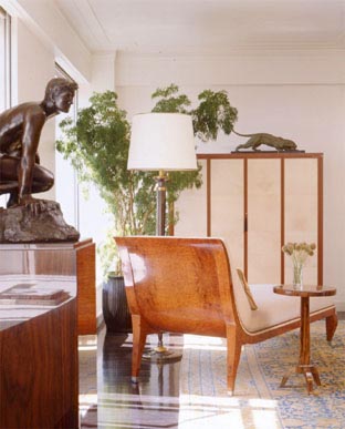
Last week when I posted this new top-ten pad I started thinking about the various spaces we've written about in the TWO PLUS years since design crisis hit the interwebs.  The very first place that always pops into my head is the one featured below.  I've reposted the post today. (look it was from November of 2008 and only 3 of you have been reading this blog that long) Originally I was obsessed with the mural in the opening picture, but whenever I think about this space now I always fantasize about the wood paneled walls.  Anyhow, let's take a look back at the days when I only had 2 cats, thought Missoni chevron was the bees knees, and I hadn't been pregnant for 41 weeks straight.  Enjoy!

+++

Good morning, good morning! What a wonderful Monday it is thanks to Raina who sent me this insane article from W magazine. After months of loyal readership she has managed to pinpoint, with laser-like accuracy, exactly what mama likes: obscene use of color? Check. Artwork run wild? Check. Garish accessories, interesting use of materials and a view to boot? Check, check, and check. Behold:

You may be wondering if I could actually wake up every morning to such a full-blown-hyper-color attack on my retinas. The answer is: yep, you bet your sweet ass I can. Did you get a load of those dogs? If I thought my pets would still come snuggle up to me at night, Laser and Magnus would be in neon lampshades faster than you could say holy good lord that's hot.

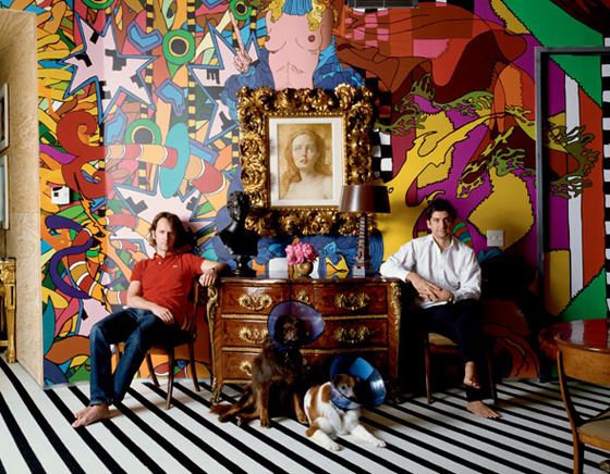
Let's talk about what's going on here: Blessed owners Tobias Meyer (ahem, head of Sotheby's worldwide contemporary art) and Mark Fletcher pose in front of mural by Brazilian artist Assume Vivid Astro Focus. A John Currin oil is perched above a French 1740s kingwood commode. Commode! Who owns one of those? Jeeze.

These dudes had me at hello, but I'm sure, like me, you're dying (dying!) for more:

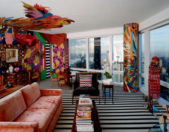
The only dream-shatterer here is the mural on the ceiling, I'm not 100% on that. But really, don't you all just want to curl up in a little ball next to that pillar while hugging the Missoni pillow, thanking whatever god you believe in that you're alive? Holy Crap my mind is going to explode!

Time for us all to hyperventilate in tandem:

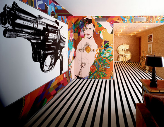
Andy Warhol gun + LIGHT UP DOLLAR SIGN + a naked man that Nagal would have painted if he'd painted men? It's just TOO GOOD! Here's what the owner's had to say:

Everything is about the reality of it all, about the human condition and facing death. Art right now is about desire, human nature, sexuality, power and violence.

These men are spending life inside a living, breathing piece of art. And I want to strangle them for it.

Kleenex time!

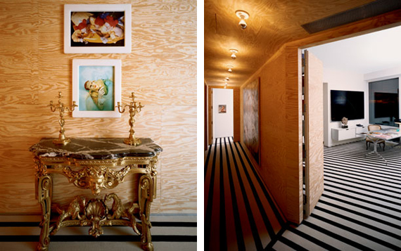
Plywood befriends the trippy Stark carpet while a diptych from Matthew Barney's Cremaster series hangs above a German 1760 gilt-wood console. The whole kitten-kaboodle is topped by German rococo ormolu candelabra (MATTHEW BARNEY!!! what is this? The freakin Guggenheim?)

The owner's note that they enjoy using low-grade materials in the design as there is "a hopefullness to it's unfinished quality." Um, right. Keep talkin, buddy. Now, don't get me wrong, j'adore la plywood, but if I even consider putting that moldy old board next to my plethora of craigslist finds, it will be all over. I think it's important to note the power of context here, with a side note that I, despite my delusions of grandure, am not the head of the world's premier art auction house.

To wrap it all up, let's take a look at the window I may or may not have to jump out of:

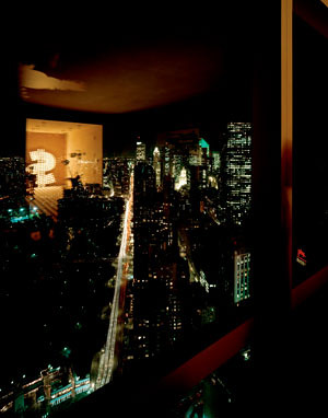
Do you see the dollar sign reflection? Doesn't it just make your heart sing? You can all send your thank you notes for providing such a majestic kick off to your week to me at godsend@design-crisis.com*.

*not a real email address, but it should be, huh?

Ask Sanders: Rossana's Pear Green Nursery

It's time for another installment in our Ask Sanders series, wherein some lucky reader has their decorating dilemma solved by our resident paint guru, Sanders Gibbs. It's a dream come true, because in case you don't already know, Sanders is a badass. But don't take our word for it -- if you live in Austin, go visit Benjamin Moore Hill Country Paints, where Sanders puts his talents to the test as store manager. Not in Austin? Catch up by reading this interview with Sanders here.

Without further ado, here's reader Rossana's question:

"My husband and I are in the process of painting the nursery. We have differing ideas about what this should look like, but we have at least found a nice compromise with the Ben Moore pear green. The gender is a surprise! The room is about a 10 x 12 room with lots and lots of windows and the one wall that is solid will be the one that we put the crib on, and this is the wall that we will paint Pear Green. Question is: what other color would be nice with PG?"

First of all, great choice! Pear Green is a bright and versatile shade that pairs (ahem) well with many colors. Sanders gave us a broad selection of gender neutral choices to pick from, and many can be mixed and matched to different effect.

pear green

Amp up the drama by mixing pear green with bold brights.

Or tone it down with neutrals. It works well either way.

For a baby's room, you could play it sophisticated by painting the crib wall pear green, the other walls off white (Sanders gave us Mountain Peak White), and then adding in other colors through accessories and bedding. Or you could funk it up by painting the other three walls a jazzier color, and then using accessories in more neutral shades. Let's take a look at some rooms with pear green and see how Sanders' choices work in them.

This playroom in the home of Avocado and Papaya's Jackie Kersh features a cute, classic palette of green, red and blue.

benjamin moore color palette

Here's Sanders' palette, which would work well in a gender neutral nursery: Pear Green with Chili Pepper Red and Peacock Blue.

Another playroom, via Cupcake Wishes and Unicorn Dreams.

And Sanders' corresponding choices are Pear Green with Stardust and Violet Stone.

I know it's not a kid's room, but the color palette in this kitchen would be fab in a nursery.

Pear Green with Banana Yellow and Florida Keys Blue.

And then there's this hotness -- who cares if the Pear Green is on a couch and not a wall? Use your imagination goggles to see that this color combo is off the chain... Loves it.

Pear Green, Mountain Peak White and Silver Dollar. DRAMA. Add a dash of black here and there and you've got a winner for all ages.

And here are a couple more pretty palettes, just because I made them up all nice in photoshop:

The bold and the beautiful: Tequila Lime, Juneau Spring, Banana Yellow, Tangy Orange, and Pear Green.

Oh so quiet and sophisticated: Mountain Peak White (loving this white!), Silver Dollar, Taos Taupe and Light Khaki. Brilliant.

That's it for this edition of Ask Sanders. Rossana, I hope there's some helpful information here, and hey -- maybe we inspired some of y'all out there to repaint. Or perhaps even have a baby... After all, what better excuse could there be to redecorate?

I'm leaving you with this picture of Ike and Sanders. Ike LOVES loves him some Uncle Sanders, mostly because Ike is obsessed with Sanders' nametag, but also because Ike has good taste in people.

If any of you out there would like some professional advice regarding your painting dilemmas, send in a request and we'll forward it to Sanders.

Thanks for sharing your expertise with us, Sanders!

The Great Indoors

Ever since the backyard demo, which, sorry, apparently I can't stop talking about, I've been mildly obsessed with plants and gardens.  The lust I normally reserve for interior design porn has temporarily been redirected and I now find myself looking longingly at well manicured lawns and big fat texas gardens.  Because I swear on all things holy that this will not become a landscaping blog and I want to give you what you're here for I've got a roundup of plants indoors.  Yes, I want them inside now too.  Basically, I want to do all my interior decor shopping at the Natural Gardener.

These are my favorite plants in today's roundup.  If anyone knows what the hell they are, pretty pleeze speak up.

Plant party on the right there is coming in at a close second. It sorta kinda looks like the world's largest rubber plant, but I'm pretty sure it's something else.  Any ideas?  This is the part where I admit that I don't really know anything about plants except that I really really like them.  Oh wait, I do know a lot about succulents, which are strangely absent from today's roundup.

I went back and forth on whether or not to post this one, after all, that wee plant is a bit sad.  However, he really stands out in this room and I thought that was what was most important.  Non?

This tree is awesome but what's with the potted plants in checkerboard formation outside?

Ok, so these last 2 shots are of retail locations, but I thought they were pretty snazzy (love that plant above!) so they're onboard.

Delicious!