Ask Sanders: Rossana's Pear Green Nursery

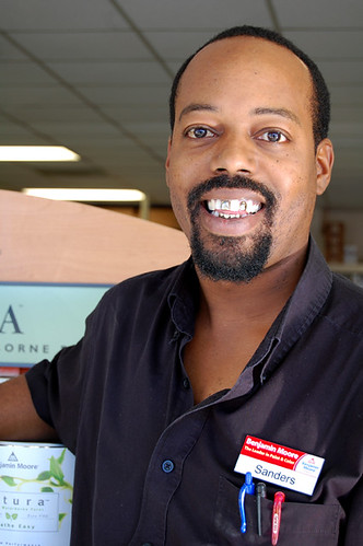
It's time for another installment in our Ask Sanders series, wherein some lucky reader has their decorating dilemma solved by our resident paint guru, Sanders Gibbs. It's a dream come true, because in case you don't already know, Sanders is a badass. But don't take our word for it -- if you live in Austin, go visit Benjamin Moore Hill Country Paints, where Sanders puts his talents to the test as store manager. Not in Austin? Catch up by reading this interview with Sanders here.

Without further ado, here's reader Rossana's question:

"My husband and I are in the process of painting the nursery. We have differing ideas about what this should look like, but we have at least found a nice compromise with the Ben Moore pear green. The gender is a surprise! The room is about a 10 x 12 room with lots and lots of windows and the one wall that is solid will be the one that we put the crib on, and this is the wall that we will paint Pear Green. Question is: what other color would be nice with PG?"

First of all, great choice! Pear Green is a bright and versatile shade that pairs (ahem) well with many colors. Sanders gave us a broad selection of gender neutral choices to pick from, and many can be mixed and matched to different effect.

pear green

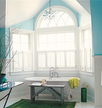
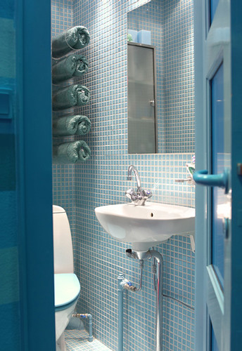
Amp up the drama by mixing pear green with bold brights.

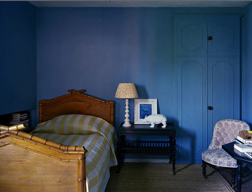
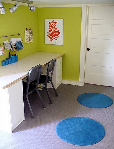
Or tone it down with neutrals. It works well either way.

For a baby's room, you could play it sophisticated by painting the crib wall pear green, the other walls off white (Sanders gave us Mountain Peak White), and then adding in other colors through accessories and bedding. Or you could funk it up by painting the other three walls a jazzier color, and then using accessories in more neutral shades. Let's take a look at some rooms with pear green and see how Sanders' choices work in them.

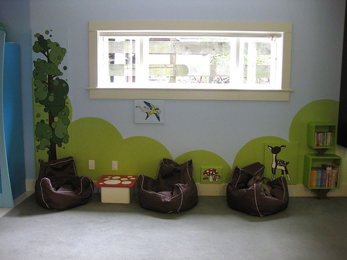
This playroom in the home of Avocado and Papaya's Jackie Kersh features a cute, classic palette of green, red and blue.

benjamin moore color palette

Here's Sanders' palette, which would work well in a gender neutral nursery: Pear Green with Chili Pepper Red and Peacock Blue.

Another playroom, via Cupcake Wishes and Unicorn Dreams.

And Sanders' corresponding choices are Pear Green with Stardust and Violet Stone.

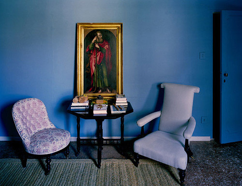
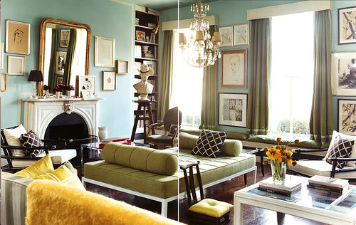
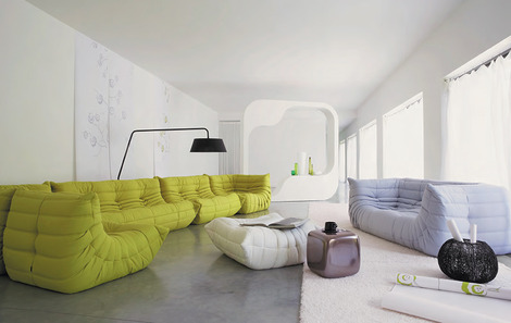
I know it's not a kid's room, but the color palette in this kitchen would be fab in a nursery.

Pear Green with Banana Yellow and Florida Keys Blue.

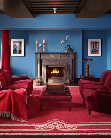
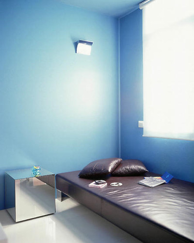
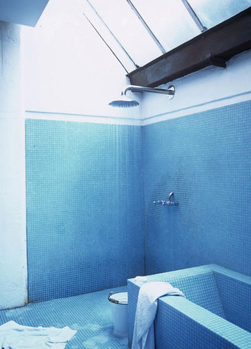
And then there's this hotness -- who cares if the Pear Green is on a couch and not a wall? Use your imagination goggles to see that this color combo is off the chain... Loves it.

Pear Green, Mountain Peak White and Silver Dollar. DRAMA. Add a dash of black here and there and you've got a winner for all ages.

And here are a couple more pretty palettes, just because I made them up all nice in photoshop:

The bold and the beautiful: Tequila Lime, Juneau Spring, Banana Yellow, Tangy Orange, and Pear Green.

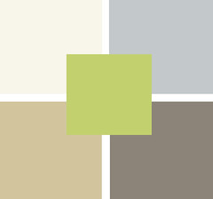
Oh so quiet and sophisticated: Mountain Peak White (loving this white!), Silver Dollar, Taos Taupe and Light Khaki. Brilliant.

That's it for this edition of Ask Sanders. Rossana, I hope there's some helpful information here, and hey -- maybe we inspired some of y'all out there to repaint. Or perhaps even have a baby... After all, what better excuse could there be to redecorate?

I'm leaving you with this picture of Ike and Sanders. Ike LOVES loves him some Uncle Sanders, mostly because Ike is obsessed with Sanders' nametag, but also because Ike has good taste in people.

If any of you out there would like some professional advice regarding your painting dilemmas, send in a request and we'll forward it to Sanders.

Thanks for sharing your expertise with us, Sanders!

Ask Sanders: Kristin's Blue Bathroom

Here at Design Crisis, we're a little obsessed with paint. What else can completely transform a room for just a few bucks and some elbow grease? Sadly, adventures in painting can go horribly awry -- the golden yellow you hoped for goes macaroni and cheese, the perfect shade of crimson you envisioned turns into a bloody nightmare, or the warm gray you yearned for reads as icy blue instead. These domestic disasters happen everyday, but our resident Paint Guru, Sander Gibbs, is here to provide all the expert help you need to ditch the heartache and pick the perfect shade the first time around.

sanders

For our first installment of the Ask Sanders column, DC reader Kristin writes with an urgent dilemma -- what shade of blue to paint the bathroom in her rental apartment? Since Kristin is planning to cover her existing flooring with peel and stick white tiles (I've seen these in action, and they're not a bad option for renters), she could choose from a multitude of colors. She says:

"I'm looking for a super-saturated shade of blue. I had originally hoped for a Vermeer/Dutch blue... Anywho, my perfect shade would be not too deep, and very refreshing. Let me know what you think! I'd also move over towards something more tropical and punchy."

The particular shade on the walls of this room in the Gramercy Park Hotel is what inspired her to ask for a color match in the first place, so I sent the image over to Sanders for inspiration:

gramercy hotel

Judging by the image and his own experience with blues that woo the eye, Sanders put together this saturated blue palette for Kristin:

sanders color palette

While the top colors are Benjamin Moore shades, the bottom pics are from Pratt and Lambert. Sanders informed me that P&L is actually a Sherwin Williams brand, but SW doesn't carry it in their stores. In Austin, Benjamin Moore is the only store that carries P&L, so if Kristin (or you) would like to try one of the P&L shades, check out the nearest Benjamin Moore for their selection.

Sanders picks look pretty close to the top picture to me, especially Clearest Ocean Blue and Paradise Lost, but as Sanders always says, "Buy a sample and make sure you paint on two coats! Two coats!" Paint shades can look totally different depending on lighting conditions, so even though you might think you're wasting your money on a sample, you could be wasting a lot more on unwanted gallons of paint. Always sample first!

I also asked Sanders to put together a palette of blues he likes, just in case his color matches don't quite hit the spot. Many of his picks are more muted, but still punchy yet versatile:

sanders color palette

Top choices are Benjamin Moore colors, bottom row is from Pratt and Lambert's palette (and Sanders' cute lil' face).

And now I think we need some eye candy to see how fresh the ever popular blue really can be when paired with the right environment. For Kristin's sake, many of my picks feature shades of blue in bathrooms, but blue is a flexible shade for many rooms (except kitchens, in my opinion).

living etc blue

Living Etc

Blue gets paired with glossy chocolate leather and a sleek mirrored cube in this minimalist treatment.

blue annie schlecter

Annie Schlecter

In the olden days, blue was a highly prized, very expensive pigment due to its relative instability and difficulty to manufacture, so it was only seen in special circumstances, like the Virgin Mary's robes. These cool blue walls and door highlight the red and green robes of a saint who must have been a little low on the totem pole.

domino blue bathroom

Domino

Multiple shades of blue work together in this eclectic bathroom. I'm really thinking someone should make colorful toilets...

blue tile

Per Ranung

Sky blue tile mixes with chartreuse, indigo and royal purple, in this otherwise spare bathroom. A healthy dose of white keeps things from going utterly schizophrenic.

blue tiles

Living Etc

Monochromatic tile makes this bathroom feel spacious. Sexy skylights and minimal fixtures don't hurt, either.

paul costello

Paul Costello

A sun filled living room mixes aqua with oregano and mimosa yellow for a fun, but sophisticated palette. Chocolate, white and gold, keep the color from getting out of control.

marie claire maison

Marie Claire Maison

I have no freaking clue how this bathroom is constructed, but I'd love to have a cerulean aquatic labyrinth of my very own. The green window frames add subtle contrast to an otherwise all over color scheme where form and texture rule.

living etc

Living Etc

If that much color scares the Scandi pants off you, paint can always freshen up an old treasure and add a jolt of unexpected color. I myself wouldn't be unhappy with this bathroom in the least.

domino

Domino

A soft, green based blue highlights the architecture of this traditional bathroom, bringing a little piece of the sky indoors.

moody blue

Annie Schlecter

Moody blue covers wall and woodwork in this spare but funky bedroom. I love the little punches of yellow and pink.

blue bathroom

Blues of varying intensity and sheen create depth in this tiny bathroom. Blue toilet set: yes or no?

Kristin, we'd love to feature before and after pictures of your bathroom here on DC, so I really hope that Sanders' suggestions inspired you to take the plunge and get to painting! I myself am feeling so serene and relaxed from this azure haze that I think I'll present Part II of this (very special, of course) inaugural Ask Sanders column next Monday. Tune in Monday and see Sanders' expert advice for Kristin's bedroom: To kelly green, or not to kelly green? That is the question.

In the meantime, feel free to send your own paint queries for Sanders to our email address: hollback@design-crisis.com. Depending on demand, we'd like to feature picks from Sanders on a monthly basis, so don't go sending us any problems that need to be solved yesterday! Sanders is good, but he can't turn back time. Not even Cher can do that.