I am officially a paint snob, and it's all Sanders' fault. When we first started painting our house, I giddily skipped around the corner to Home Depot and completely denuded their paint sample wall. I mean, I took every. single. sample. While I ended up choosing one of their colors for my bathroom (which was a HIDEOUS and GLOSSY macaroni yellow mistake that got painted over not once, but twice), I couldn't find a color for my kitchen or bedroom to save my life. I must have bought 30 samples (no lie!) and every one of them skewed red or blue or looked muddy or garish -- I'm sure many of you have had the same frustrating experience with paint. Dragging my heels in defeat, I drove the extra two whole miles to Benjamin Moore after reading countless blogs' shining praise of their paint and color selections. That's where I met Sanders.
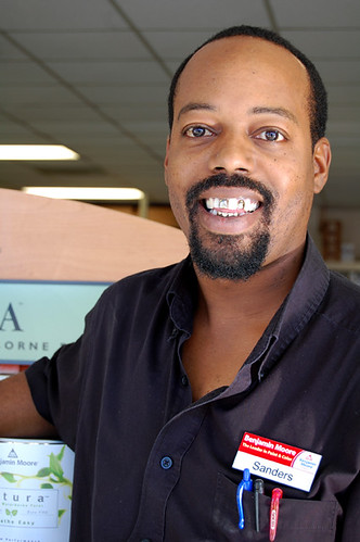
Sanders has this crazy encyclopedic knowledge of color that he started accruing way back in 1997 while working for Benjamin Moore, and he's now the manager of South Austin's Hill Country Paint. If you tell him a color name, that man can give you the number. He helped me pick several different shades for my house, and remembers every color I've even chosen. In short, even though Benjamin Moore's paint is more expensive than Home Depot's, Sanders has saved me a lot of money and time. He even talked my cheap behind (and Karly's) into buying the $50 a gallon Aura paint, and I will never buy another paint again. It covers like a dream, and it even smells delicious (low VOC rocks!). Do I sound like I get my paint for free? I don't. It's just good paint.
The power of paint to transform a space is divine, and since I first met Sanders I've painted almost every room in this house, so we've seen each other relatively frequently. When Karly and I started this blog, we told him about it and Sanders is now one of our oldest readers. He still reads it every night, and can recite all of our adventures in detail (which is slightly unnerving, and reminds me that I need to be more careful about what I write). So I promised Sanders that as soon as we had more than 5 readers, I would make him TOTALLY FAMOUS by interviewing him.
When the day finally comes, I walk in and ask if he's ready, and he says he's so nervous he couldn't sleep last night. I laugh because I'm pretty used to Sanders telling me what's what in his kingdom, and it's mildly entertaining to see his swagger a little diminished. But as soon as we sit down to talk paint, he's all cool, calm and collected business again. I tell him that a lot of interior designers are currently painting spaces black and ask him what he thinks about that. (photo via Living etc.)
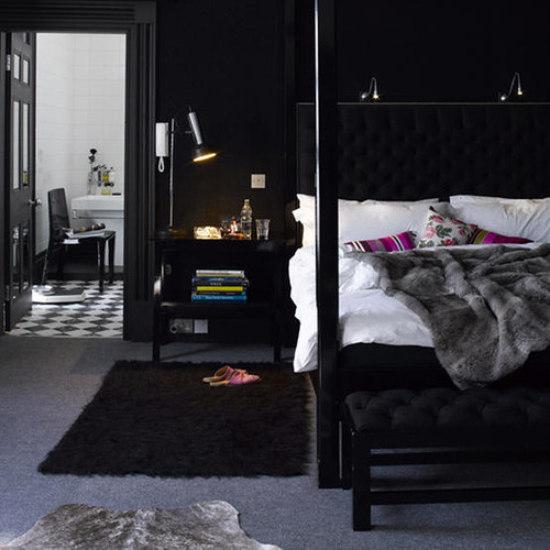
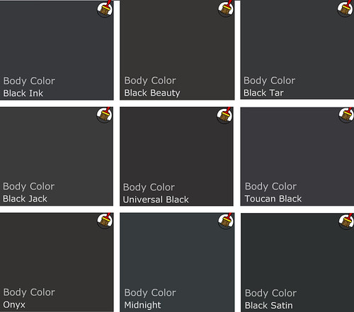
He looks a little bemused, pointing at himself in his black shirt, and stutters slightly, "W-w-wellllll...." It's pretty clear he doesn't like the idea, but to say so goes against his first priority, which is to give the customer what he or she wants. He goes on to say that he wouldn't personally paint his home black, and certainly not black black, but maybe a "shade of black. It's a personal choice." I ask him if he thinks dark colors make small spaces look smaller, and he says, "Dark colors are fine for small spaces. The right tone of color works for a certain unique space. You don't have to stick to whites and pastels. Dark colors can lend masculinity and power to a room." He does say that natural light is helpful for a small, dark space, "because light is your ally," and also to stick to "small scale, sleek furnishings" so that the room doesn't feel too heavy and oppressive. I ask him to pick a black color palette, and this is what he chooses.
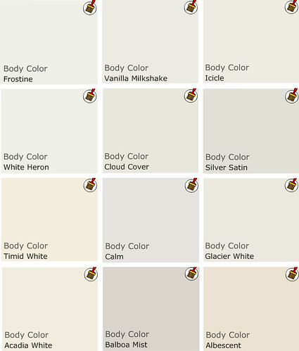
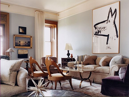
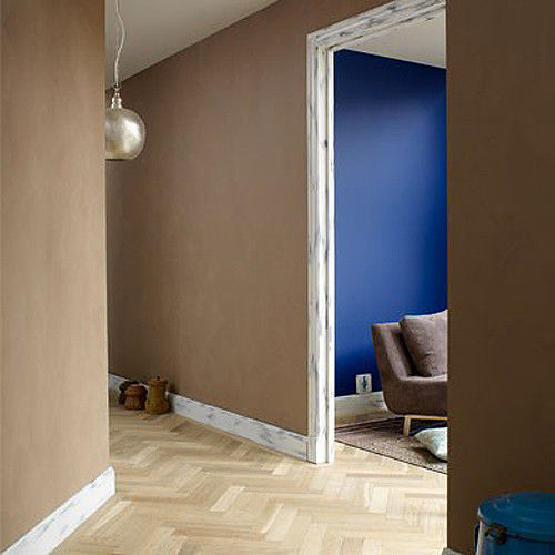
I then ask him about white, since it seems overwhelmingly to be the most popular paint color in all the decor magazines. (photo via Living etc.)
He frowns a little and hesitates. Nope, not white, either -- although he is careful not to say that explicitly. He says that if you have great architecture and lots of light, white can be good, but again, not pure white. "Off white is rich and soft." I ask for his favorite whites, and this is the palette he chooses:
By the way, if you buy the Aura paint and you're painting a light color over a light color, you can probably get away with only one coat if you're a good painter. It worked for me in several rooms, it looks good, and I saved a lot of time and paint. But sssshhhhhh, don't tell Sanders, ok?! His favorite thing to say is "Two coats! two coats!"
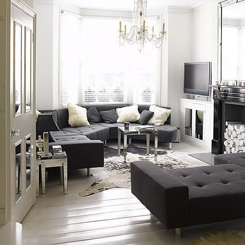
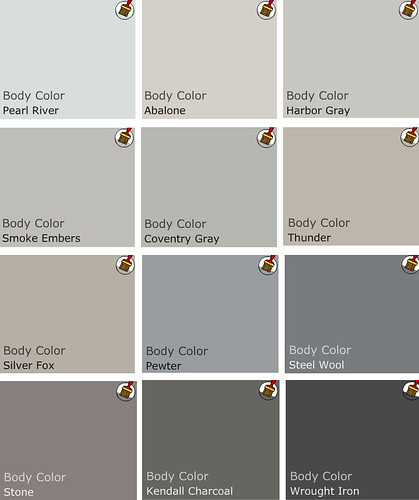
Alright, I say, how about gray? His face lights up. A string of happy expletives tumble out. Mothereffing yes! Yes, gray is good! In fact, Sanders knows many of them by heart, including the ones I have chosen for my house (Abalone and Silver Fox, as well as Karly's Harbor Gray). "Gray is neutral, but not boring. It's versatile." (photo courtesy of Jeffrey Bilhuber)
If you've ever tried to pick a shade of gray paint, you know how hard it is. Nothing is quite pure gray. Sanders points to all the undertones in the different shades, and stresses the importance of choosing a gray that looks good in your personal space. "The biggest mistake people make is not buying samples. Everyone's light is different and paint changes in the environment it's in." I ask him if people often come in complaining about their paint selections and he says, "No. It's 'cause I make sure they get a sample." That and Sanders is a color matching wizard, capable of choosing something great to match the rest of your house, or custom mixing the shade of your dreams. Here are his picks for grays:
As we chat, Sanders eats his lunch and we reminisce about how we became friends. For some reason, early on he asked me where I was from and when I told him it was Texarkana (a tiny town at the corner of Texas, Arkansas, and Louisiana), he said he had lived there for several years, too. We spent the better part of an hour laughing about how craptacular T-town can be, and we've been pals ever since. There's nothing like bonding over harrowing times, to be sure. I ask him about his son, who is now three months old, and his face is downright beatific. "He's growing and changing and adapting to his new world." It's obvious that his son is the apple of his eye, and I ask him what colors he painted the nursery. He tells me that he has light wood floors and this is his household color palette:
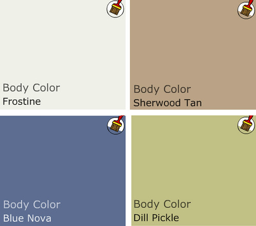
And I imagine that his house looks something like this, with a shot of lime in the baby's room:
(photo via The Style Files) Very cozy, right?
Since so many people are pretty clueless about the nuances of color, I ask him how he might help a person who has no idea what they want. "I would ask them about their favorite foods, you know, places where they might go to vacation, what their interests are." What about the whole psychology of color theory, where red is hungry, blue is soothing, etc? Sanders shakes his head and says, "Different strokes for different folks. People should have unique colors. The Dewey Decimal System of color is not the way to go. It's an outdated idea." What about the idea that you choose colors that look good on you, so you always look good in your environment? He shakes his head again. Another string of verrrrrry funny expletives, and I start giggling. A browsing customer looks my way and I try to take it down a notch. "You don't need to choose colors that look good on you, but clothing choices may reveal fondness for colors. You don't have to keep the staus quo, though."
I go on to quiz Sanders on some technical stuff and things, so here is Sanders' Wisdom, from him to you:
For walls, matte or glossy: MATTE. Definitely.
Even for bathrooms: Yes.
What about for trim: Glossy, and oil will give it that extra kapow ZING. (insert hand motions here)
What kind of paint do you use for concrete floors: For low sheen, use paint grade concrete stain, which is not a true acid stain. For an opaque paint, use latex Porch and Floor paint (also good for wood floors). For a glossy finish, use an oil base paint.
Can you paint tile: Yes, but you MUST use a 100% acrylic primer. Then you can cover with any paint, but the primer is the key.
How about a bathtub: No. You need an epoxy paint for that.
As we finish up, I thank Sanders for his time and expertise, and he gets all nervous again. "Don't bash me, ok?" Don't worry, Sanders. There's nothing to bash!

THANKS SANDERS!
This write up is running long, so tune in on Thursday to see Sanders' picks for the hottest new color trends. His palette is so on point, Elle Decor UK is currently running some of the same picks. I promise it will be the super antidote to fall and winter's dreary, gray days.