Shelter Mag Smack Down: Elle Decor vs. Met Home

On the same day that the news broke of Domino's demise, I received my March issues of both Elle Decor and Metropolitan Home in the mail.  Each Magazine crying out:  read me first! I'm better!  I deserve to survive this dreary economy!  Oh, and how about you renew your subscription while you're at it?  With the passing of several shelter magazines over the last several months, rest in peace, Vogue Living, one has to wonder what it takes to stay alive, and furthermore, to stay on top.  Rather than picking a mag to read first, I flipped through them simultaneously, page for page, I compared these last-men-standing, to see which would survive the battle of the fittest.
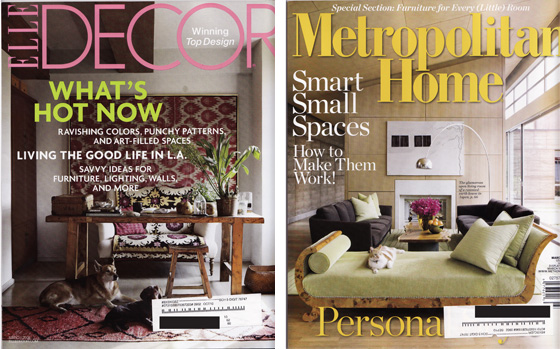
While Elle delivers color, PUPPIES!, and lots of Madeline Weinrib, Met Home gives me an arch lamp, KITTENS!, and a light filled, but otherwise dull space.

Cover Challenge winner:  Elle Decor.  While I am more of a cat person, I do prefer all the fuchsia to those drab gray sofas.  The bent-wood chaise is endearing, but a bit to Viking for my taste.
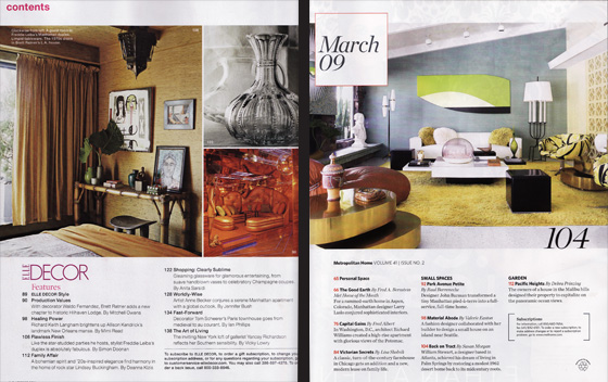
On the left, Elle's table of contents gives us 3 preview shots of upcoming stories, while Met only shows us one.  Met really makes it count though, with that uber-hot gold table on the right hand side.

Table of Contents Challenge Winner:  Draw, not only do these two look nearly identical side by side - perhaps someone's graphic designer is moonlighting? - but even the copy editors seem to be collecting paychecks from both companies:  Met Home headlines with "Capitol Gains," a story, presumably on a DC home, while Elle Decor spoon feeds us "Insider Trading" a slightly more mysterious title but with little variation from the former.
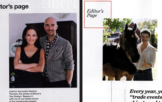
For some reason, I always read the editor's letter in any magazine.  I don't know why, they're never that great and tend to be the editorial version of a beauty pageant contestant's response to her question on current events.  Margaret Russell kills in her letter this time, bringing both praise and criticism to this year's Top Design winner, Nathan Thomas.  Margaret seems to appreciate Nathan's style, but the letter acts as a disclaimer reminding the readers that she would rather set fire to her hair then have his hastily decorated apartment in her magazine, but, well, rules is rules.  Donna Warner talks about the economy (snooze) and a bunch of trade shows she visited that had fabulous(!!!) new items, none of which appear in this month's magazine.  

Editor's Letter Challenge Winner:  Elle Decor.  Mrs. Warner drove a hard bargain posing next to that horse, and, I tell you, it just about tipped the scales, but Mrs. Russell's letter was too good to pass up.
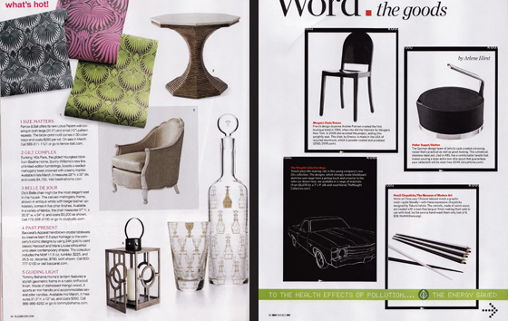
Each magazine gives a sneak peak of the items we will most surely crave in the up coming months, according to Elle, we will want lots of pattern, color and well, pattern and color.  Apparently, Met Home thinks we will want a bunch of crappy stuff painted black and awkwardly framed.  What you cannot see here is that Met Home's "Word" section is actually sprinkled with more variety than Elle's but it's a bit confusing and across the map... soooo:

Trend Spotting Challenge Winner:  Elle Decor.  While I appreciate the variety in the Met Home display (again, not fully shown) I value the clarity of vision presented by Elle just a little bit more.  This was a tough call and I really wish that the horse from the table of contents had been in this section, making my choice that much easier.

Each magazine has a lead story that veers a bit off course from the rest of the edition's fare:  Russell delivers on her promise to feature Top Designer, Nathan, while Warner gives us some brew-ha-ha about prefab houses.  Honestly, I didn't read the article, I already subscribe to Dwell.

Lead Story Challenge Winner:  Draw.  You may remember that Erin and I already covered Top Design ad nauseam, so that was a bit old hat, about as old as, say, prefab housing.
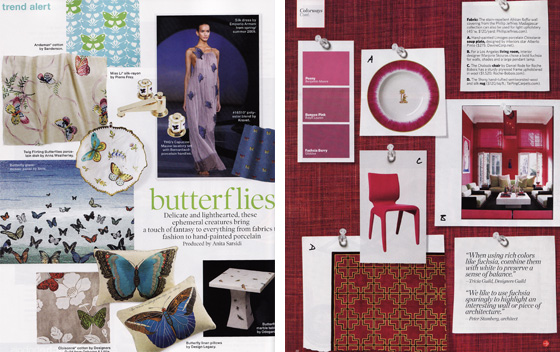
Elle and Met Home each take a tour of the globe bringing us back the most salacious treats our hearts can handle, and will most surely kill to obtain. Elle Decor promises that butterflies are the new black, while Met Home counters with the argument that we will all be causing riots in the streets to get our hands on every possible bit of fuchsia.  (Remember, Fuchsia was all over the cover of Elle, so, apparently, they unknowingly agree)

What's Hot Now Challenge Winner:  Met Home.  Ok, Elle Decor, Butterflies?  Really?  I know that the last butterfly trend was laid to rest circa 1999, so, working on the 10-year-trend-cycle, mathematically, these winged beauties should be on deck, but I have to say, sometimes trend math is wrong and I'd really like to pop those suckers back in the vault for another 5 years.  Met Home, on the other hand, you've read my mind:  I really have been into the hot pink lately.  Pssst, you would have scored double if you'd trash-talked red, currently my least favorite color.
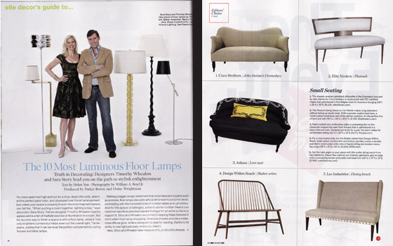
All of our contributors spend hours upon hours to bring us the best pieces of furniture currently in production.  Elle is loving floor lamps this month, while Met gives us a taste of love seats, nesting tables (small space issue) and convertible sofas.

Individual Medley Winner: Draw.  Wile each magazine had a couple of pieces of eye-candy, none were lust worthy and most were on par with an after-dinner-mint rather than a big bowl of chocolate mousse.  

Finally, each magazine dukes it out with their version of decor porn.  First up:  Elle
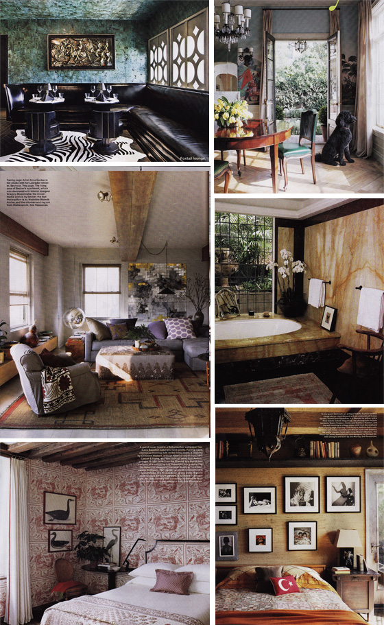
A few of the more notable rooms from this edition, each are from different homes.  Meh.  While I would probably live in most of them, I'm not really peeing my pants with excitement either.

Next Up, Met Home: 
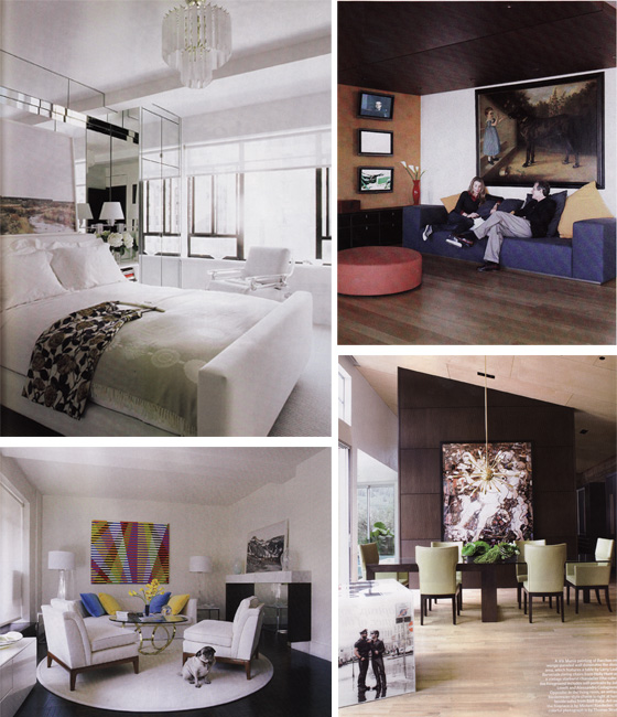
Really, only a few things stood out to me in this issue:  the mirrored wall in photo 1 (drool) the cocktail table, bottom left (gold!) and the barely visible side-table, bottom right (leather bar!)

Home Tour Challenge Winner:  Elle Decor.  While I would never consider quantity over quality, Elle certainly seems to have both.  I would like each editor to turn it up a notch, though.  You, Me, Erin and the rest of the design blog-o-sphere drop design bombs day after day, most of which induce much more hyperventilation and raised heart rates than these entire magazines combined.  We all know there's so much more out there, so why did I just spend my weekend putting together this post while intermittently yawning?

Start Measuring the Drapes!

It's FINALLY over and ____________ won! Hooray! So, can you tell that I write my posts in advance? I haven't the slightest clue who won the election, but I'm hoping his name rhymes with "Yo Mama." If so, then I heard he started measuring the drapes in the White House months ago (according to the Republican pundits, anyway). I certainly hope so, because The White House is looking tired from the wear and tear of the last eight looooooooooooong and harrowing years. Don't you think a little facelift for our nation's treasure, first inhabited by John Adams some 500 billion years ago, would bring a spring to the step of Americans everywhere? Shall we not cast off the grime and stench of fear and oppression (and an overwhelming use of floral chintz) and usher in a new era of class and dignity? Hellz yes, I say. Come with me and follow this sad tale of covering up perfectly good decor with schmaltzy crap just to make your mark in The White House. Hmm. Sounds like a metaphor for the story of this country. The next president has definitely got his work cut out for him.

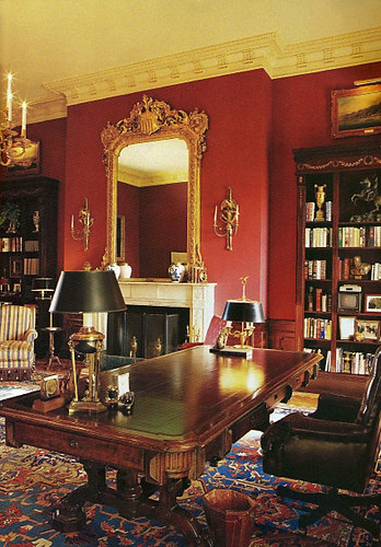
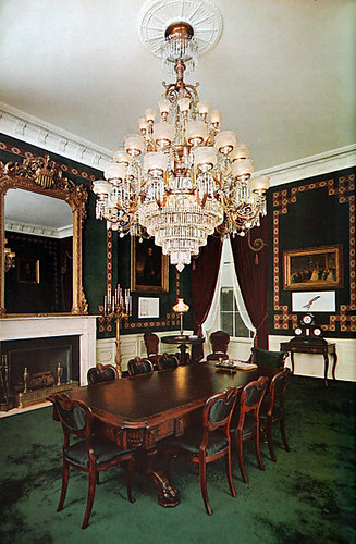
Before George HW Bush, the historic Treaty Room remained unmolested since Jackie Kennedy's renovation of it from random parlor back to its original 19th century roots. Apparently a bunch of treaties were signed in the the Treaty Room. Go figure.

treaty room

The green carpet is not my favorite, but it looks all presidential and stuff, whereas George the Senior's iteration of the Treaty Room looks like someone's half blind grandma decorated it (complete with a bunch of half blind grandpas).

treaty room

The curtains are particularly bilious, and when combined with the medallion carpet, the overall impression sets my stomach to roiling. Also, why must they fill the room with a bunch of dark and patterned stuff, and then leave the walls naked?

The Treaty Room in the Clinton years, while still fussy, at least looked balanced. Dramatic paint helped a lot.

treaty room

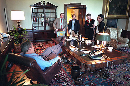
And it was definitely better than Bush the Current's version of this room, which painted over the Clinton red and went back to daddy's unstyle (Can't have the stink of good Clinton decisions hanging about, can we?).

treaty room

Golly, aren't you going to miss this zany cast of characters?! But I bet you won't miss the crappy decor. Verdict: democrats are better decorators than republicans. Further evidence to be presented below.

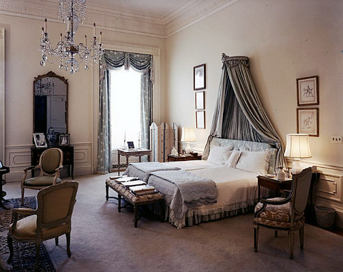
jackie o bedroom

Jackie Kennedy's master bedroom could easily grace the pages of decor glossies today. Contrast it with the Reagan's Ted Graber decorated version.

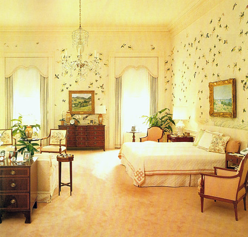
reagan bedroom

Dear Jeebus, it looks like a plague of locusts flew in, perhaps planning to carry that wimpy bed out the window with them. Horrid!

And then there's the sad transformation of this sitting room:

sitting room

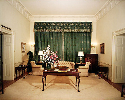
In the 50s, Eisenhower stuffed it full of bland furniture crammed into dark corners, and covered the best asset of the room with ugly curtains that pop out like a jack in the box

sitting room

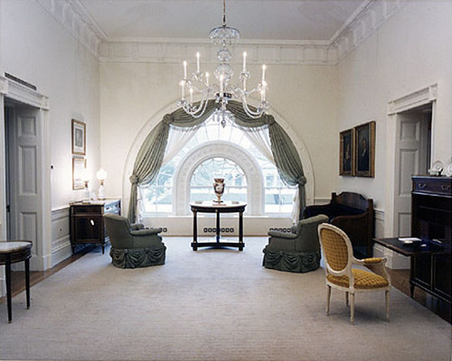
Would you ever have guessed that this gorgeous window lurked beneath those putrid curtains? Jackie Kennedy and decorator Stephane Boudin opened up the space with light and a color palette that feels fresh and contemporary, even today. Things went downhill from there.

sitting room

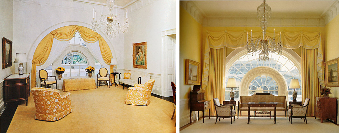
In 1975, someone went a little hog wild with the yellow and flower prints, and by 2000, the transition from classic to stuffy was almost (but not quite) complete.

sitting room

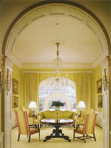
2006, yet ripped from the pages of a 1987 back issue of Southern Living, this room is out of scale and out of whack.

Sometimes the changes are more subtle, but equally ill advised. For example, the Red Room.

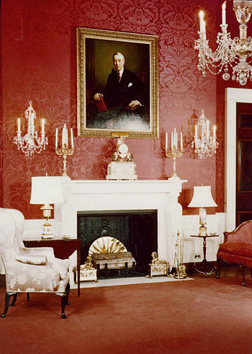
red room

Here it is in the 50's, looking much like a bordello with that red damask wallpaper and the double entendre candelabras. Jackie took the hooker vibe down a notch while still preserving the red hot drama.

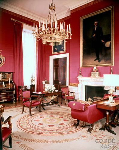
red room

Jackie knew something about scale, fo sho. That painting looks so much better there, and I like that the curtains blend with the walls, because there's a lot going on in here. The chandelier is less fussy than above and I'm glad that nasty red carpet is gone, but I'm not super keen on its replacement. But wait!

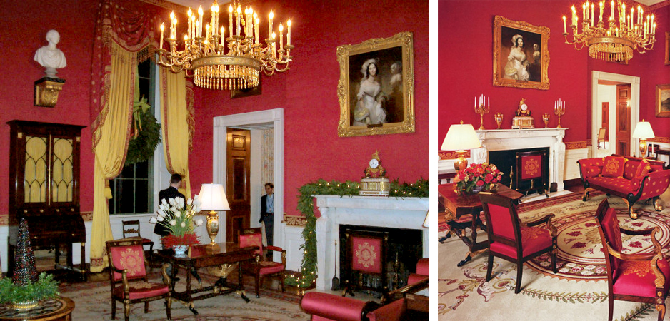
red room

Let's redecorate and keep the carpet, but eff everything else up!!! That painting is WAY too wee, and the curtains are so overblown that I have to stop myself from making more sex jokes. I wonder what Jackie must have thought about all this "sprucing up" of her much improved decor. Yes, these are current pictures.

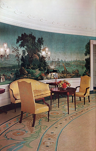
At least a few of the improvements she made were so undeniably good that they could not be touched. She redid the Diplomatic room from this:

diplomatic room

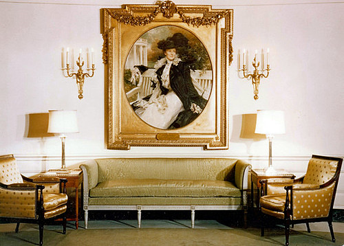
To this:

diplomatic room

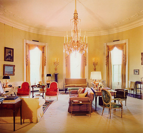
And it still looks the same today. I loooove the crazy mural wallpaper that stretches all the way around the room, and her use of yellow is surprising. Here's another yellow room she did:

yellow room

Lots of color -- love the red chairs! -- and simple shapes, very little pattern. Cut to today:

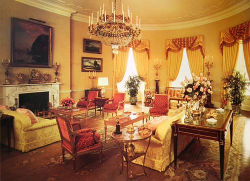
yellow room

Ewwwwww! The shapes got curvier and pouffier and everything got barfed on by pattern. And those drapes!!! The story of the White House seems to be one of terrifying fabric choices and completely overwhelming drapery. Hate it.

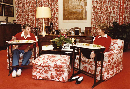
Just look at this hideous sitting room used by Ron and Nancy:

sitting room

Need I say anything about this lovechild of Charlotte Moss and Mario Buatta? No. I need not. But to be nonpartisanish, the room wasn't much better when it served as JFK's bedroom.

jfk bedroom

Maybe Jackie decorated it little boy style so JFK would feel embarrassed about screwing around on her in here. Could you picture Marilyn in this bed? Keep your mental images to yourself, please.

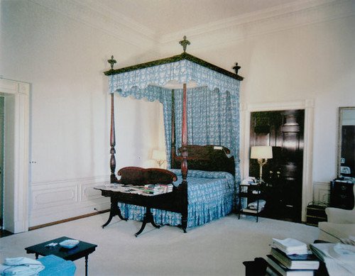
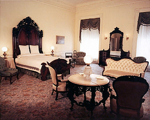
Still, Laura Bush redid the Lincoln bedroom, and I think it actually looks better than Jackie's version.

lincoln bedroom

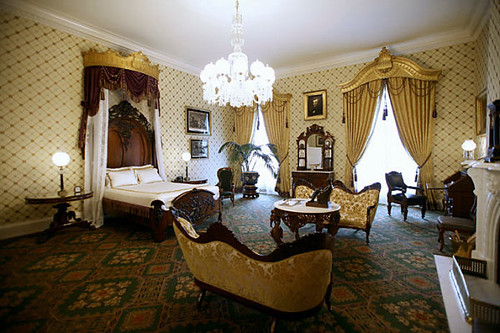
Jackie's looks unfinished to me. I don't like all that dark stuff floating on white walls. Laura did fill out the space a bit, if not in the same way I would have done it:

lincoln bedroom

Although I probably could have done it for less than $530,000. No wonder our country is in debt!

Laura Bush may not have the style of Jackie O, but she's still a nice and classy lady. Very unlike Cindy McCain, who spent the cost of the Lincoln Bedroom on one outfit. You can't buy taste. And Laura's certainly classier than Sarah Palin, who would probably turn the White House into a trailer park full of broken snowmobiles, moth eaten bear hides, and crabs.

Of course, I am hoping for none of the above to freshen up the White House. Yes, Michelle Obama has loads of style, and doesn't need to spend a lot of money to get it. I'm looking forward to some smart, restrained choices in The White House, both on the drapes and otherwise.

Discussion, for all two of you who finished reading this entire novel: What designer would you like to see work with Michelle (or Barack... who knows? Maybe he really cares about fabric?) to redecorate the White House? What would you like to see them do?

Everyone Do the Longo

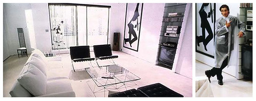
Remember Wall Street in the shining chrome-plated 80's? Impeccably dressed stock brokers raked in millions through day trading while repeating the corporate mantra, "greed is good," with zombiesque vacancy. And for the privileged few, living in a pressure cooker meant a penchant for Oliver Peoples glasses, Valentino suits, Crane's calling cards, and glass walled apartments overlooking Central Park, much like Patrick Bateman, anithero of Bret Easton Ellis' brilliant satire of elegant 80's excess, American Psycho.

american psycho

(Ok, I need to get this off my chest: this is the part of the film where Christian Bale/Patrick Bateman talks about how much he likes Phil Collins, which almost (but not quite) ruined Christian Bale's uber hotness for me because I REALLY HATE PHIL COLLINS. SUSSU SUCK ON THIS, PHIL.)

But I digress. Bateman's tastefully minimal apartment swathed in white, beige and white -- all the better to showcase the housekeeper's skills as well as his ultra luxurious accoutrements -- represents the apex of 80's wealthy urban living. That and his life-sized Robert Longo lithographs.

longo montage

Images courtesy of the artist at Artnet.

Much has already been made about the dark side of 80's greed. There's Patrick Bateman himself, a self-imagined psychotic killer, Less Than Zero's protagonist who dies of cocaine overdose in a hyperfast society driven by glamor and wealth, and then there are Longo's prints of corporate archetypes writhing against the confines of their high pressure lifestyles.

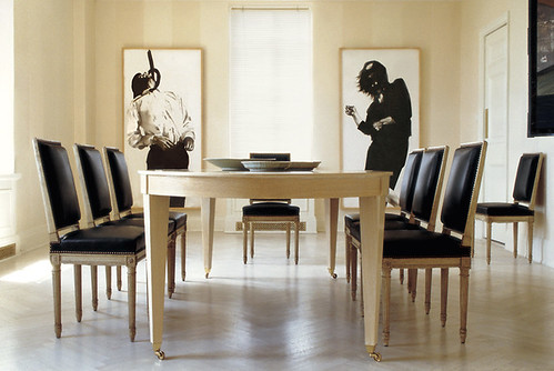
So what does it say about the state of our current society and economy that prints from Longo's Men in the Cities series have recently made a comeback on the walls of today's well-heeled homes?

longo scheerer

Tom Scheerer, master of all things beige and white, used two original Longo prints as focal points in this extremely tasteful dining room. Snark aside, I actually love it, possibly because I have been reprogrammed to URGENTLY NEED light light walls by the recent blitz of white washed everything, or possibly because the macabre side of me might enjoy the choking feeling that would come from looking at that print while eating. Perhaps it would help with portion control.

Moving on to more Longo sightings:

longo montage

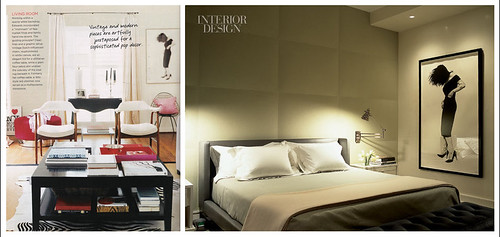
Left image from Domino, spotted on M.A. Belle's lovely blog, Right image from Interior Design.

That's Gretchen, and she's had a tough day. I think she is a popular choice because Gretchen's a little less edgy than some of the more obviously distressed people, and her black dress and heels are classic and therefore still au courant. In other words, she's pretty and I'd have her in my bedroom any day. Heh heh.

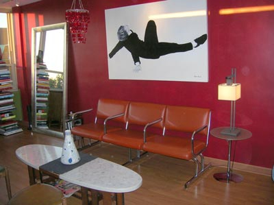
The latest sighting was over at Apartment Therapy, at least I think this is a Longo:

longo red

It sure looked better in its natural beige habitat, didn't it? Way too much contrast here. Maybe there is a point to having white walls, you know, other than to highlight my lack of obsessive cleaning and all of the imperfections in my 40 year old walls, not to mention the lower than 20 foot high ceilings and complete nonexistence of decorative woodwork. Sigh.

The good news is that Longo's prints are not completely unattainable. Well, the original 70" tall lithographs are (unless you have 5-7k earmarked for artwork, in which case, why don't you send some of that sweet sweet love my way, pretty please?), but the posters are quite affordable and while they're substantially smaller, they still have graphic impact. Lithographs and reproductions are available through Bird Fine Art, as well as through Ebay.

If you care to send me a pair of prints, I think I'd like Larry and Ellen here:

ellen larry

So tortured and ironic. What do you think? Could you find a place in your home to do the Longo?