Have a Rootin' Tootin' Shootin' Good Time

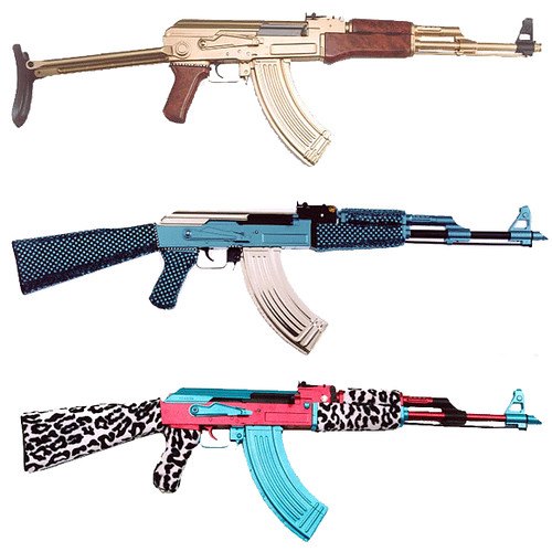
Tomorrow we leave town on our annual Thanksgiving pilgrimage. Every year my enormous family congregates at our farm near Texarkana, and we all enjoy good food, good company, and lots of redneckified activities, like ridin' four wheelers, burnin' stuff, and shootin' up a storm. I'm all about the four wheelers and any activities involving fire, but despite early indoctrination (I first shot a Glock at eight), I'm more than a little squeamish about guns. Because the only ass that's getting a cap busted in it is probably mine. Despite my misgivings, I really want to join in the fun. But I'm not even going to consider picking up a gun unless it looks like one of these:

guns

(via Xirdalium)

Because, you see, everything does not look better in black. In fact, many things look good in pink and aqua with leopard on top, and there ain't nothing that don't look better in gold. No kind of thing.

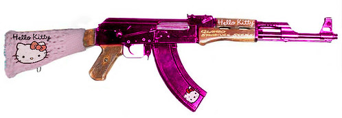
Even though I was an eight year old badass with the hard black heart of an assassin, as a 32 year old wussy I may need to slowly ease my way back into the game. You know, get my feet wet. Try on some training wheels for size.

hello kitty ak

(via Glamguns)

Pretty pink Hello Kitty knows how to make a girl feel soft and feminine, but everyone knows that bitch can fight when backed into a corner. Watch out for the claws when they come out! Pft!

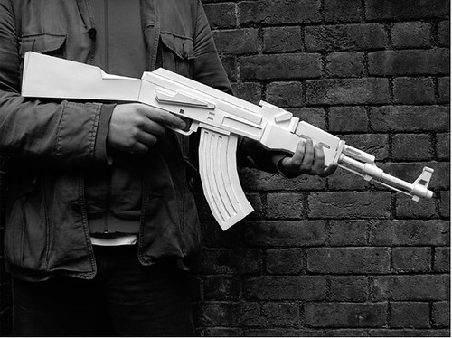
Who am I kidding? I may need to start out even... slower. Like, really slow. Like, more decorative, less lethal, slow.

paper ak

(via A+R Store)

This paper AK-47 is probably a little more my speed. Pretty, but ineffectual. I'll look really cool while holding it, but self inflicted injuries will be kept to a minimum. Now we rollin! Dog.

Honestly, I kind of prefer the more old school weaponry. A little more Wild Wild West, with saloons and spurs, and weapons that aren't in the least automatic. Although the lack of modern medical technology is a definite minus for the accident prone. Wonder who that might be...

guns montage

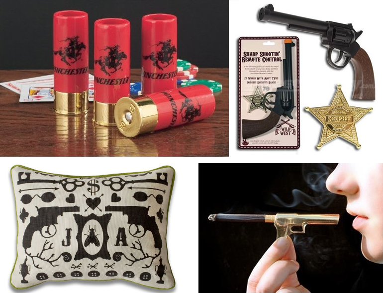
Awwwww yeah. Bet you thought I forgot this was a design blog! What have we here? Winchester shot glasses from Amazon, which are potentially lethal in a totally different way; A pistol shaped remote control seen at Design Boner that my dad would kill for; the uber slick "Smoking Gun" via This Next; and Jonathan Adler's whimsical needlepoint pillow, adored by pistol packin' grandmas everywhere.

Of course, my newfound frippery would look fabulous against this old-school-meets-young-stunna backdrop:

thug stripe wallpaper

Designer Wallcovering carries Thug Stripe black and white gun wallpaper. Yes, please. And I have just the thing to cast a perfect, decoratively violent, glow upon it.

rock and royal

Rock and Royal (purveyors of the OG nefarious pirate ship chandelier) think that everything looks better under crystal, and they can glue, string, stitch, or wire it together in just about any configuration imaginable. I'm just not sure if I like the AK or the snub nosed pistol better:

rock and royal

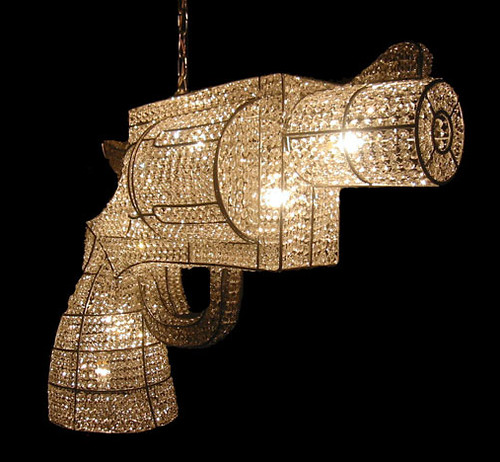
Whereas the AK is sharp and pointy, the pistol is so soothing and unassuming. It says, "What, me? Dangerous? Never." Kind of like that douchebag boy you dated in high school, and you remember how that turned out. Alrighty, AK it is!

Or maybe I don't want any guns hanging over my head. They don't exactly connote the same sense of imminent death that, say, a guillotine might. Still, there are only a few wires keeping that barrel off my neck. Perhaps I'd be better off with something gravity bound.

philipe starck

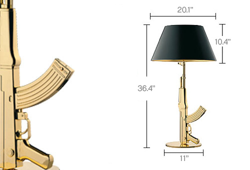
I blogged about this super fly gold table lamp by Philippe Starck a hundred million years ago, but time has done little to assuage my lust. I like that the business end is pointed up. I like gold. I like fetishize guns. Enough said.

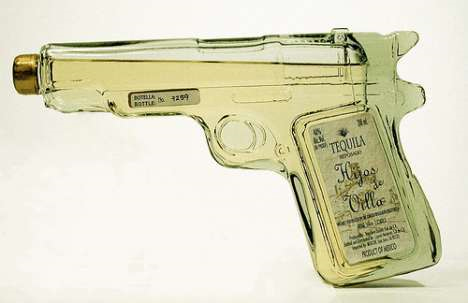
But if I'm being realistic, I'd probably get the most use (and street cred) out of this little number:

tequila flask

(via Trendhunter)

Everyone respects a gun-shaped flask full of tequila. Especially during the holidays.

Yes He Can: A Top Design Story

Alas, the moment we have been dreaming about for months has arrived.  After much nail biting and speculation, the question was answered:  would America be able to elect it's first female Top Designer?  Apparently not.  Wednesday, November 5th, 2008 will forever be known as the day that subversive Nathan spray painted his way to victory.  Did you get your copy of the newspaper? By way of Nathan's win, America stood up and collectively shouted "No!!!  we can not take one more season of traditional design, Preston":

The better of Preston's dull rooms.  Note the Target pillows

The master bedroom that is absolutely, 100% made for sleeping

portfolio shot for job position at Rooms to Go the dining room

Ondine fell just short of victory, which may or may not mean that she now has to take Andrea to dinner and buy her a nice outfit at a posh New York store:

the actually cute girls room that (DRAMA!) almost didn't happen.

It's a shame that they have some intern with a point-and-shoot take these photos, they've managed to completely cut out the largest, and most interesting part, of this space:  the art work which stretched all the way to the ceiling.

Don't you guys feel like we would all like these rooms much more if we had seen them months ago when they were designed?  The time-lapse makes them all seem so passe now.  Oh, and I hate that light paired with the table (too small) and the wallpaper (too underwhelming).

The living room, minus the zebra rug, not so bad

Nathan and stole the show with, ahem, this:

The judges could not stop flipping out about this space and, aside from the groovy sculpture, I don't get it.  Maybe if I were actually IN the space?  I dunno.  I do appreciate that he skipped the formal living room and made a pretty, albeit useless, entryway.

boring bedroom 2.0: now with white curtains!

Nathan almost lost due to the criminally large sarcophagus in the family room.  He did pull at my heart strings a little by recognizing the flaw and not wanting to ask the movers to carry it back outside.  But then again, who carried it out after production was complete?

Clearly the best space in the house (and possibly throughout the entire season of the show) Nathan's dining area.  LOOK!  It's my table!  In white!  Despite how much I enjoy this space, I really can't stand that PAPER PLATE chandelier. I'm all for DIY, it's the reason my broke-ass has a nice home, but really, could you imagine presenting Margaret Russell with a chicken-wire-and-paper-plate chandelier?  You'd have to have ballz (or a ballsack shaped swarovski light) to try to pull that off.  Nathan, you had 80Gs to spend on this house, c'mon.

And finally, the centerpiece of this episode:

Kelly adds 10 years to her age while, ironically, trying to look like a little girl.  I actually like the dress, it's the braids, Kelly.  The braids!

We here at DC headquarters were so excited about this historic event, we even threw a party.  Here are some pictures*

*Election party photos substituted for photos of non-existent Top Design Party

So, there you have it.  Nathan won.  Eddie was mean.  Kelly was crazy pants.  Jonathan's marriage is no longer valid and, praise jesus, I don't have to write about this crap anymore.

editors note:  the part about Jonathan is bologna, get it together California.

Supersize Me

When Karly and I went to the Round Top antiques fair last month, the most common sentences uttered between us were either, "If only it was a tenth of the price!" or "I just wish it was bigger." At that moment I realized I had developed a severe case of megalomania, although (silly me!) I should have seen it coming a year ago. Sometimes I feel like I'm just stumbling around aimlessly in the world of design, being as I am just a lowly artist type, and it so often happens that I'm a bit slow to catch onto the latest trends. But methinks this one caught me unawares because I mistook it for art. But it's not art. I don't think. Take, for instance, the work of Dutch design duo Studio Job:

studio job

Their dazzling white gold, mosaic-covered, Silver Ware series for Bisazza featured traditional tabletop pieces in monstrous proportions; the teapot alone is six feet tall (photos courtesy of Dezeen and The LA Times).

studio job

Yet, only a few years ago, according to the International Herald Tribune:

Studio Job was condemned by Dutch design critics for its disdain for function and for its self-indulgent symbolism. "It was horrible," recalled [co-designer] Smeets. "We were accused of making bad art by the art world, and bad design by the design world." Today they are being lauded, for exactly the same reasons, as the poster boy and girl of the new expressionism in design.

So caught between art and design -- or let's say concept and function -- Studio Job occupies a nether region of functionless and lack of concept, wrapped up in a shiny package with a (very) high price tag.

But what's the difference between Studio Job's giant spoon:

studio job

And Claes Oldenburg's giant spoon (photo from Minneapolis Sculpture Garden):

claes oldenburg

No, I don't think the only difference is the cherry on top, but seriously no one disputes Oldenburg's status as a "real" artist. Is it only because he thought of making things that are usually small really big first? (This sculpture was made in the mid 80's, but he started making gigantical sculptures in the 60's.) And he's certainly not the only artist to make giant sculptures. Take the always colorful artist Jeff Koons, for example (via If It's Hip, It's Here):

jeff koons

I'm extremely distracted by the gorgeous background, but how is this giant balloon dog different from, say, designer Jaime Hayon's giant creepy doll thing (other than the difference in zeros on the respective price tags. Hint: artist Jeff Koons' is exponentially more expensive):

jaime hayon

Both sculptures are big and shiny, but could we say that Jeff Koons' includes some kind of cultural critique of society, whereas Jaime Hayon's does not? Maybe. I'd be interested to hear some of you super smart readers argue either side of that point.

What is it about epic proportions on everyday objects that make them so interesting, anyway?

robber duckie

Is there anyone who is not transfixed by this ridiculously ginormous rubber duckie? I didn't think so. And no, it's not photoshopped.

The design world definitely seems to have picked up on the "Bigger is Better" aspect of our culture, because big is REALLY BIG right now.

marcel wanders

Marcel Wanders certainly looks pleased with his gargantuan "table" lamps. Of course, there's no table in the world they could fit on... except maybe one of the silver "tea platters" by Studio Job, featured near the top of the post.

Perhaps he was just trying to one-up Philipe Starck's design for the Parris Landing Condominiums?

philipe starck

Whatever the case, a relatively scaled down megalomania is wending its way through the homes of middle class consumers everywhere, as evidenced by this popular pad on Apartment Therapy:

apartment therapy

How much do you love that giant screwdriver on the left??? It looks dangerous, which I am quite sure is the appeal for me. And check out the Mini-Me version of Starck's giant light bulb. The surge of supersized objects doesn't end there, though:

anglepoise lamps

Even the typically refined anglepoise lamp -- designed in the 40's with smaller scaled homes in mind -- has been pumped up by massive steroid injections. Unlike a scintillating six foot tall teapot, this lamp could fit right in to today's McMansions. (photo on left via Desire to Inspire, photo on right via Apartment Therapy)

Another example of Design/Art's (Des'Art?) trickle down economics:

giant fork

Giant fork sculpture in Missouri via some guy's Myspace evolves into giant fork wallpaper from Anthroplogie (pictures via Apartment Therapy):

anthroplogie wallpaper

Becomes giant fork in Mads Lauritzen's surrealist photograph. Because improper proportions are surreal.

mads lauritzen

For some reason giant cutlery is really popular right now, and that brings back painful memories of those huge wooden forks and spoons that everyone's Mom had on the kitchen wall. Whatever you do people, please don't go there.

I have to admit that I like some of the more practical supersized designs. There's a big difference between Studio Jobs's giant golden coffeepot dumping a stylized brown river of what I can only hope is coffee:

studio job

And these nifty giant golden hand chairs seen in the sweetly elfin Jonathan Adler and adorably scathing Simon Doonan's house, which was featured in Met Home:

jonathan adler

By the way, I'm sure Adler got his chairs from super chic antiques dealer Todd Merrill, but I've seen them in hideous colors for as little as $30 on Craigslist and Ebay. Gold spray paint anyone? Or white, even?

Whew, I'm tired from thinking so much today, and I really hope I haven't worn you out too much to discuss exciting things like: art versus design, or the decline of western civilization, or whether all design will simply grind to a halt in the face of a deepening recession. Is megalomania bound to shrink in direct proportion to our shrinking economy?

In case the real question you want to answer is, "Why do I have to read this crap? I'm not in school anymore," I have a present for you:

supersized bunny

It's a super cute, supersized bunny! And if you like it, you won't click on this link to find out what happened to it.